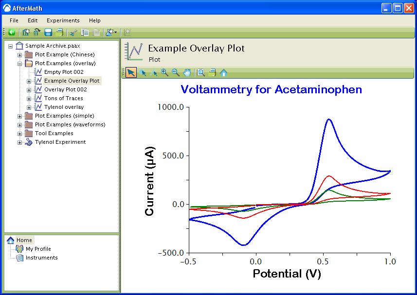
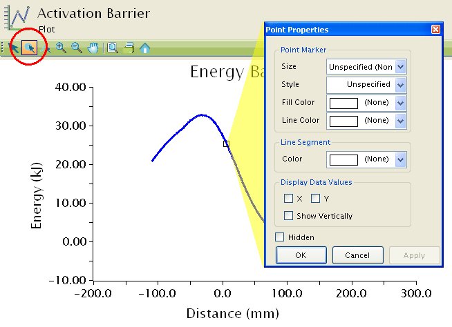
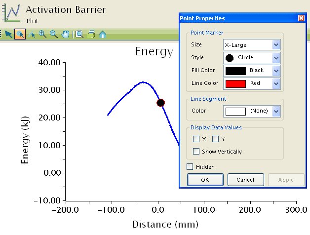
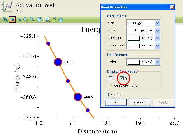
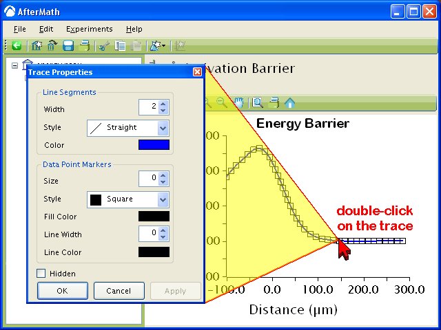
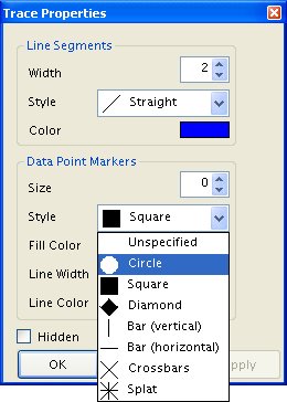
 To change the appearance of a trace on a plot, double-click on the trace to activate the “Trace Properties” box. This box gives you control over the colors, linewidths, and markers used to draw the trace on the plot.
Traces which contain a large number of data points are usually represented by drawing lines between adjacent points. In the example to the right, the trace is represented by connecting adjacent data points with a blue line segments.
By changing the “Width” of the line segments, it is possible to make the line segments appear much thicker, or to make the line segments disappear entirely (by setting the width equal to zero).
You can also change the color of the line segments. If you double-click on the color box (which is a blue rectangle in the example to the right), another color selection box appears, and you can choose just about any color you wish for the line segments.
Note that the data points themselves are not represented by markers in the example to the right. This is because the “Marker Size” has been set equal to zero. Because this trace has so many data points, it is a good idea not to use markers to represent all of the individual data points.
In the examples shown below, there are fewer data points on the plot. With this few data points on the plot, it makes more sense to mark the individual data points with a symbol. The example shows each point marked with a filled red circle, but other markers are also available.
The examples shown below also illustrate two different line segment styles. The example on the left shows the “straight” line style, where a single, straight line segment connects adjacent data points. The example on the right shows the “staircase” line style, where two line segments (one horizontal and one vertical) are used to create a more rectangular, stair step appearance for the trace.


