mobile-main-menu-button
Menu

Category Archives: Uncategorized

  • AfterMath: Supported Instruments

    AfterMath_NEW
        This article is part of the AfterMath Data Organizer User’s Guide

    The AfterMath software is compatible with the following instruments manufactured by Pine Research Instrumentation:

    Read More
  • AfterMath: Plot Terminology

    AfterMath_NEW
        This article is part of the AfterMath Data Organizer User’s Guide

    AfterMath has the capability to plot data as an experiment is progressing and to view data in plots thereafter. The article herein serves to explain important plot features by defining the following terms:

    • sheet
    • plot area
    • axis area
    • data point
    • trace
    • point marker
    • point connector
    • plot axis
    • major tick mark
    • minor tick mark
    • axis title
    • axis unit
    • trace segment

    Sheet, Plot Area, Axis Area

    aftermath_plot_page_area.jpgPlots are viewed on computer display screens as well as printed as hard copy records of experimental data. Because plots are frequently printed, it is useful to think of some aspects of plotting in terms of where the plot is located on a printed page.

    The entire page on which the plot appears is called the sheet (yellow shading in the plot). The sheet often has the same aspect ratio as a standard paper size, but for purposes of viewing on a computer display, the aspect ratio may sometimes be stretched to make better use of the available area on the display.

    The region on the plot where data points are actually drawn (shaded green in the example to the right) is called the plot area. The plot area may be resized and moved to any location on the sheet that you wish. In general, it is a good idea to make the plot area as large as possible so that the data points are easy to see.

    Any region just outside of the plot area where axis labels and an axis title are displayed is called the axis area (shaded pink in the example to the right). Most plots have two axis areas (left and bottom), but some plots may have an additional vertical axis (right) or horizontal axis (top), and in these cases there may be three or four axis areas.

    Data Points, Traces, and Point Markers

    aftermath_plot_marker_example.jpgThe smallest entity found on a plot is a single data point, representing the location of an ordered pair within the plot area. When a series of related data points are drawn on the plot in a manner intended to show that they are related, this series of points is collectively referred to as a trace.

    The example plot herein shows a portion of a larger trace. The four visible points on this trace are represented using a point marker. AfterMath allows you to choose the point marker for each trace (circle, square, diamond, etc.), and you may choose the fill color and border color for most markers. You may choose to mark each individual point on a trace with a different point marker, or you may choose not to mark any of the points at all.

    The four points are connected together using short blue line segments called point connectors. AfterMath allows you to choose the color and line width for point connectors, or you may choose not to use point connectors. In general, if a trace contains a large number of data points, it is better not to use point markers, but rather to draw only the point connectors.

    Plot Axes, Axis Title, and Tick Marks

    aftermath_axis_example.jpgMost plots have at least one visible plot axis. A plot axis is typically divided into regular intervals using tick marks. The tick marks which have a numeric tick mark label next to them are called major tick marks, and the those which fall between the labels are called minor tick marks.

    It is good practice for a plot axis to have an axis title to indicate what quantity is being measured along the axis, and this title should also include the scientific unit associated with the measurement, such as “Current (mA)” or “Pressure (kPa)”. The scientific unit used to scale the axis is called the axis unit. The axis unit should be chosen so that the numeric tick mark labels have a reasonable magnitude (i.e., avoid units which cause excessing leading or trailing zeros).

    Trace Segments

    The AfterMath software supports the idea that a single trace may be logically broken up into smaller pieces called trace segments. This concept is best illustrated using an example. The trace shown in the plot below represents several successive scans acquired during an electrochemical experiment. One of these scans has been colored red to distinguish it from the rest of the trace. This red portion of the trace represents one of several trace segments which, taken together, comprise the entire trace.

    As a result of the voltage being scanned back and forth during the experiment, the trace consists of several overlapping scans. Because of the way the data from this experiment was recorded, AfterMath can distinguish between one scan and the next scan, treating each scan as a separate trace segment. AfterMath provides a special “Segment Selector” tool which permits you to select data points from a single trace segment or from several specific trace segments.

    aftermath_trace_segment_example.jpg
    Read More
  • AfterMath: Creating a New Plot from a Data Table

    AfterMath_NEW
        This article is part of the AfterMath Data Organizer User’s Guide

    Multiple Methods to Put a Trace on a Plot

    There are a variety of ways to put a trace on a plot, and you should take the time to learn about all of them. Here is a list of some of the ways to do this:

    Creating a New Plot from a Data Table

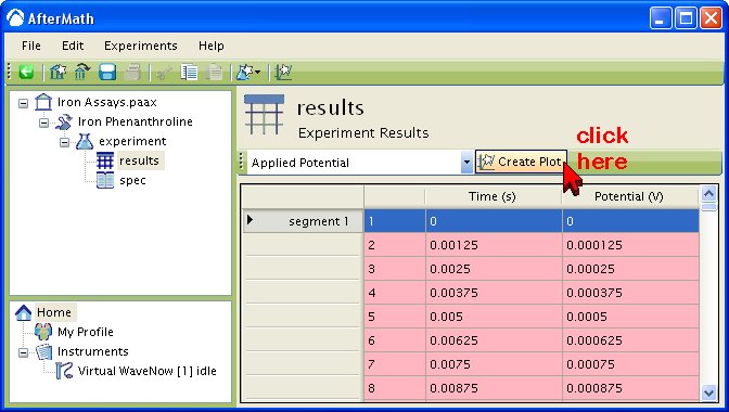
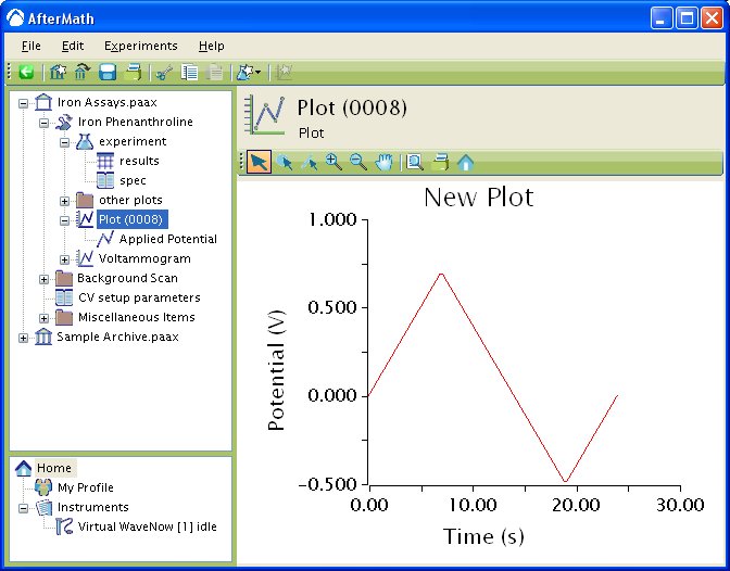
    If you are viewing a measurement signal in a data table, you can create a new plot which displays this signal by simply clicking on the “Create Plot” button near the top of the table. There are two steps to perform this operation and they are described below.

    Step One

    Click on the “Create Plot” Button
    aftermath_table_create_plot_button.jpg

    Step Two

    View the New Plot in the Archive
    aftermath_table_create_plot.jpg
    Read More
  • AfterMath: Changing the Plot Location

    AfterMath_NEW
        This article is part of the AfterMath Data Organizer User’s Guide

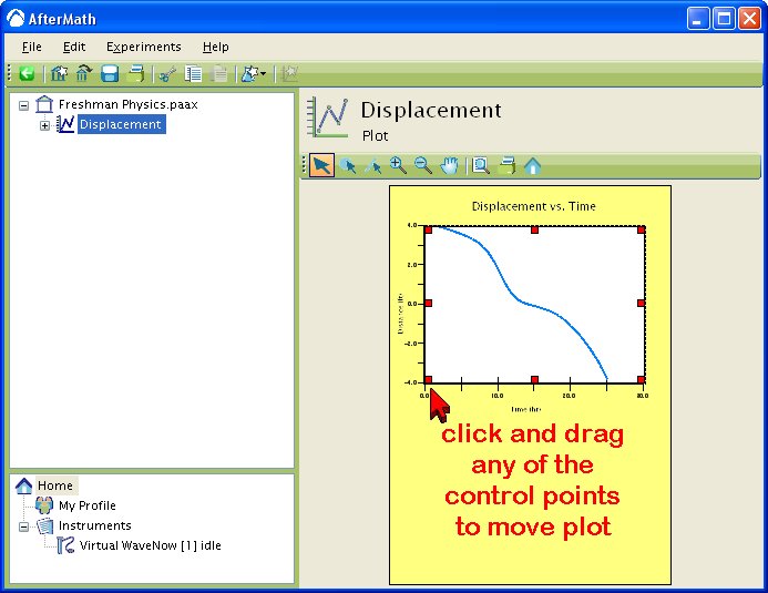
    The location of the plot area on the sheet is easily changed by selecting the plot area and then dragging the corners of the plot area. This feature is most useful when a sheet size corresponding to a standard paper size has already been chosen. You can position the plot anywhere on the sheet that you wish.

    aftermath_plot_move_example.jpg

    Read More
  • AfterMath: Scientific Plotting

    AfterMath_NEW
        This article is part of the AfterMath Data Organizer User’s Guide

    Overview

    This section of the manual deals with the powerful scientific plotting features of the AfterMath software. You can use AfterMath to create very simple plots containing just one trace (like the one on the left, below) or extremely complex plots containing multiple traces, axes, and measurement tools (like the one on the right, below). AfterMath gives you flexible control of line widths, plot symbols, colors, tick marks, gridlines, and text.

    aftermath_plot_overview.jpg

    Users are encouraged to take the time to carefully read this section of the manual to become familiar with all of the plotting features offered by AfterMath.

    Read More
  • AfterMath: Changing the Sheet Size

    AfterMath_NEW
        This article is part of the AfterMath Data Organizer User’s Guide

    Stretch-to-Fill Mode

    When a plot is first created, the sheet size will automatically expand or contract as needed to fill all of the available viewing area in the AfterMath window on your computer's screen. In the example plot (below), the sheet (shaded yellow) fills the Main Viewing Area to make it easy to see and edit the plot. When the sheet size behaves in this manner, the sheet size is said to be in the stretch-to-fill or simply fill mode.

    aftermath_plot_sheet_stretch.jpg


    When you are creating a complex plot or performing a lot of data manipulation on a plot, it is generally a good idea to leave the sheet size is the stretch-to-fill mode. However, when you are preparing to print a hard copy of a plot, it is a good idea to set the sheet size so that it corresponds to the size of the paper that you will be using.

    Selecting a Sheet Size

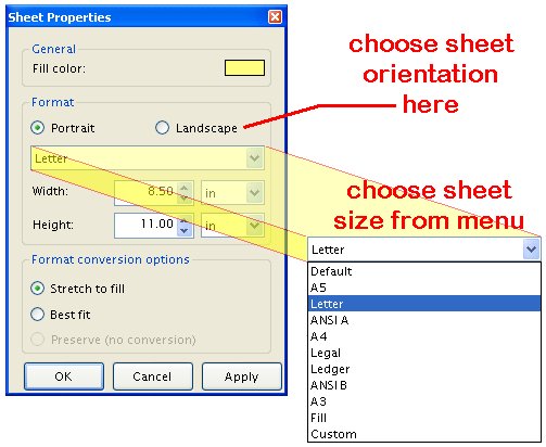
    To select the sheet size of a plot, right-click on the sheet area of the plot and choose the “Properties” option from the popup menu. The Sheet Properties box will appear and provide you with several options regarding changing the sheet size (see below).

    aftermath_plot_sheet_popup.jpg


    In the Sheet Properties box, you can adjust both the sheet orientation and choose one of several standard paper sizes.

    aftermath_plot_sheet_size_menu.jpg


    After you have selected the desired sheet size, press the “OK” button and the plot is repositioned on to the new sheet. In the example below, the plot has been placed on to a sheet with an aspect ratio corresponding to a standard A4 letter.

    aftermath_plot_sheet_size_a4.jpg


    One of the first things you will notice about your plot when you switch to a standard sheet size is that all of the text on your plot appears much smaller. When using a standard sheet size, all fonts are scaled so that they will appear at the correct size when printed in hard copy form. This can make the text very difficult to see on your computer screen, but the fonts appear in the expected sizes when actually printed.

    Changing the Sheet Size

    From time to time, you may wish to switch either the paper size or the paper orientation for a plot. The AfterMath software must make many decisions about how to resize your plot when you change the sheet size. The default behavior resizes all elements of your plot so that it fills the new sheet size that you have selected.

    In some cases, however, you may wish to override this default behavior. The “Format Conversion” options on the “Sheet Properties” box can be used to override the default behavior.

    For example, you may wish to preserve the aspect ratio of the previous sheet size even as you switch the plot to a new sheet size. Choose the “Best fit” option to do this.

    Or, you may wish for the absolute dimensions of the plot to remain unchanged as you switch to a different paper size. Choose the “Preserve” option to do this. Note that this option can produce strange results if you are switching from a larger paper size to a smaller paper size.

    Some care is required when switching paper size and orientation. Repeated changes to the paper size can lead to undesirable scaling of the plot to ever decreasing size.

    Read More
  • AfterMath: Changing Plot Background Colors

    AfterMath_NEW
        This article is part of the AfterMath Data Organizer User’s Guide

    Changing the Sheet Background Color

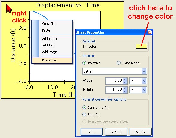
    The background color for the sheet is white by default. You can change this to any other color by right-clicking on the sheet area and choosing the “Properties” option from the popup menu (see below).

    aftermath_plot_sheet_color_change.jpg

    Changing the Plot Area Fill and Border Colors

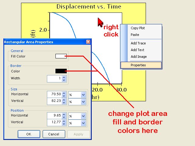
    By default, the background color for the plot area is white, and there is no border drawn around the plot area. You can change the background and border colors by right-clicking on the plot area and choosing the “Properties” option from the popup menu (see below).

    aftermath_plot_area_color_change.jpg
    Read More
  • AfterMath: Copying Plots

    AfterMath_NEW
          This article is part of the AfterMath Data Organizer User’s Guide

    The easiest way to create an exact copy of a plot is to perform a copy-and-paste operation in the archive tree. In the archive tree, simply copy the plot of interest. Then, paste the plot back into the archive at any location of your choosing.

    Read More
  • AfterMath: Creating a Plot

    AfterMath_NEW
        This article is part of the AfterMath Data Organizer User’s Guide

    Creating a Plot from a Data Table

    The easiest way to create a plot is directly from some data in a data table. When you are viewing a data table, there is a button near the top of the table labeled “Create Plot”. If you click on this button, then a new plot is created which has one trace on it. The trace shows one of the signal relationships from the data table. This information is discussed in more detail in another section of this manual (see Section 3.2 Data Tables).

    Creating an Empty Plot

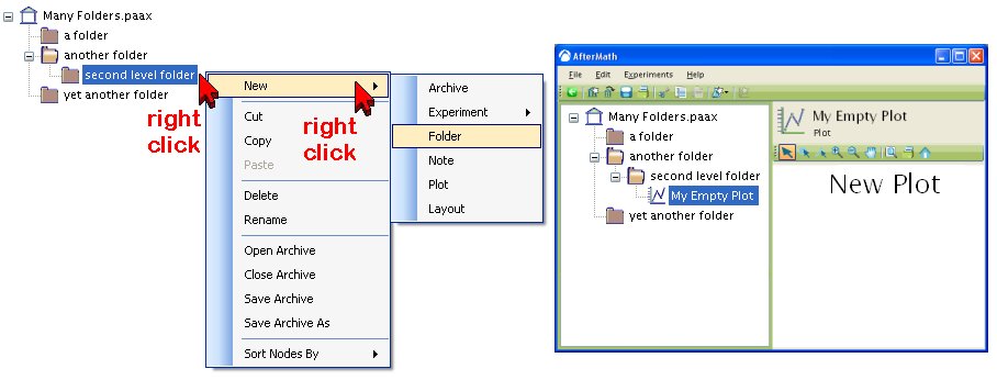
    You may create a new and empty plot in an archive by right-clicking at the desired location within the archive and choosing “New » Plot” from the popup menu.

    aftermath_create_empty_plot.jpg

    An empty plot isn't very interesting. You can add traces to an empty plot in one of the following ways:

    Read More
  • AfterMath: Login Screen

    AfterMath_NEW
        This article is part of the AfterMath Data Organizer User’s Guide

    Single-User, English Language Login Screen

    Most AfterMath installations are intended for use with a single user who is assumed to speak the English language. When this type of AfterMath software installation is started, you are presented with a Login Screen as shown below. Simply click on the “OK” button to begin using the AfterMath software.

    aftermath_login.jpg

    Read More